Demo
Usage
Import the Avatar primitive and styles.
 DB
DBimport { Avatar, Flex } from '@aws-amplify/ui-react';
import { FiSmile } from 'react-icons/fi';
export default function DefaultAvatarExample() {
return (
<Flex direction="row">
{/* Avatar with image */}
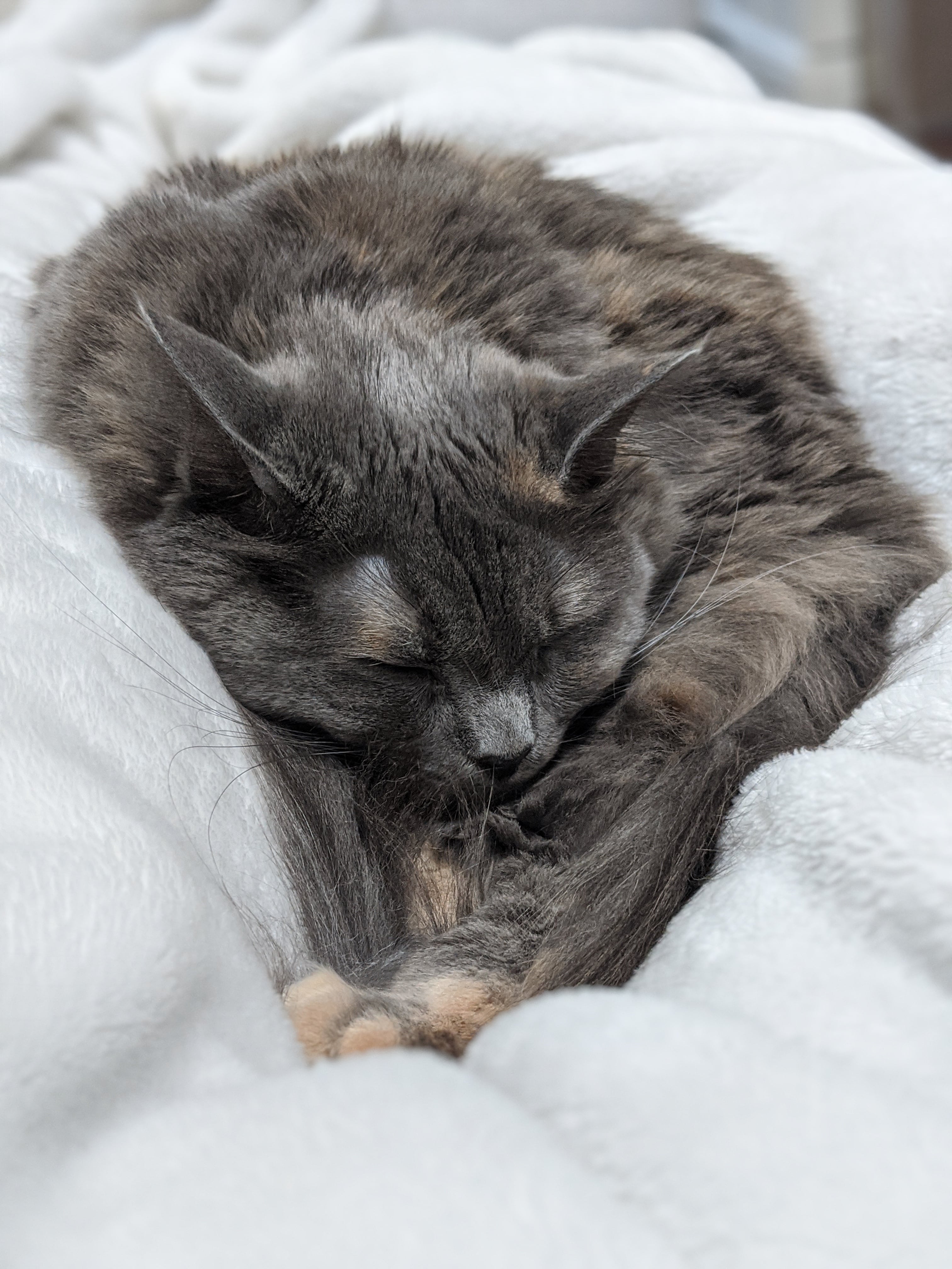
<Avatar src="/cats/5.jpg" alt="my cat" />
{/* Avatar with default placeholder icon */}
<Avatar />
{/* Avatar with initials */}
<Avatar>DB</Avatar>
{/* Avatar with custom icon */}
<Avatar>
<FiSmile style={{ width: '60%', height: '60%' }} />
</Avatar>
</Flex>
);
}
Sizes
import { Avatar, Flex } from '@aws-amplify/ui-react';

export default function AvatarSizeExample() {
  return (
    <Flex direction="row">
      <Avatar size="small" />
      <Avatar />
      <Avatar size="large" />
      <Avatar size="small">DB</Avatar>
      <Avatar>DB</Avatar>
      <Avatar size="large">DB</Avatar>
    </Flex>
  );
}
Variations
import { Avatar } from '@aws-amplify/ui-react';

export default function AvatarVariationExample() {
  return (
    <>
      <Avatar />
      <Avatar variation="outlined" />
      <Avatar variation="filled" />
    </>
  );
}
Colors
import { Avatar, Flex } from '@aws-amplify/ui-react';

export default function AvatarColorExample() {
  return (
    <Flex direction="column">
      <Flex direction="row">
        <Avatar />
        <Avatar colorTheme="info" />
        <Avatar colorTheme="success" />
        <Avatar colorTheme="warning" />
        <Avatar colorTheme="error" />
      </Flex>
      <Flex direction="row">
        <Avatar variation="outlined" />
        <Avatar variation="outlined" colorTheme="info" />
        <Avatar variation="outlined" colorTheme="success" />
        <Avatar variation="outlined" colorTheme="warning" />
        <Avatar variation="outlined" colorTheme="error" />
      </Flex>
      <Flex direction="row">
        <Avatar variation="filled" />
        <Avatar variation="filled" colorTheme="info" />
        <Avatar variation="filled" colorTheme="success" />
        <Avatar variation="filled" colorTheme="warning" />
        <Avatar variation="filled" colorTheme="error" />
      </Flex>
    </Flex>
  );
}
Loading
import { Avatar, Flex } from '@aws-amplify/ui-react';

export default function AvatarLoadingExample() {
  return (
    <Flex>
      <Avatar isLoading />
      <Avatar isLoading colorTheme="info" />
      <Avatar isLoading variation="outlined" colorTheme="success" />
    </Flex>
  );
}
Changing the default icon
You can use the <IconsProvider> to change the default icon for all Avatars in your application.
import { Avatar, Flex, IconsProvider } from '@aws-amplify/ui-react';
import { FiUser } from 'react-icons/fi';

export default function AvatarIconProviderExample() {
  return (
    <IconsProvider
      icons={{
        avatar: {
          user: <FiUser />,
        },
      }}
    >
      <Flex direction="column">
        <Avatar />
      </Flex>
    </IconsProvider>
  );
}
Styling
Theme
You can customize the appearance of all Avatar components in your application with a Theme.
Avatar Theme Source
import { Avatar, ThemeProvider, createTheme } from '@aws-amplify/ui-react';

const theme = createTheme({
  name: 'avatar-theme',
  tokens: {
    components: {
      avatar: {
        borderRadius: '6px',
        borderWidth: '4px',
      },
    },
  },
});

export default function AvatarThemeExample() {
  return (
    <ThemeProvider theme={theme}>
      <Avatar />
      <Avatar variation="filled" />
      <Avatar variation="outlined" />
    </ThemeProvider>
  );
}
Target classes
| Class | Description |
|---|---|
amplify-avatar | Top level element that wraps the Avatar primitive |
amplify-avatar__image | Class applied to the img element |
amplify-avatar__icon | Class applied to the icon element |
amplify-avatar__loader | Class applied to the loader element |
--amplify-components-avatar-background-color--amplify-components-avatar-border-color--amplify-components-avatar-border-radius--amplify-components-avatar-border-width--amplify-components-avatar-color--amplify-components-avatar-error-background-color--amplify-components-avatar-error-border-color--amplify-components-avatar-error-color--amplify-components-avatar-font-size--amplify-components-avatar-font-weight--amplify-components-avatar-height--amplify-components-avatar-info-background-color--amplify-components-avatar-info-border-color--amplify-components-avatar-info-color--amplify-components-avatar-large-font-size--amplify-components-avatar-large-height--amplify-components-avatar-large-width--amplify-components-avatar-line-height--amplify-components-avatar-small-font-size--amplify-components-avatar-small-height--amplify-components-avatar-small-width--amplify-components-avatar-success-background-color--amplify-components-avatar-success-border-color--amplify-components-avatar-success-color--amplify-components-avatar-text-align--amplify-components-avatar-warning-background-color--amplify-components-avatar-warning-border-color--amplify-components-avatar-warning-color--amplify-components-avatar-width
Global styling
To override styling on all Breadcrumbs components, you can set Amplify CSS variables or use the target classes like .amplify-avatar class.
/* styles.css */
.amplify-avatar {
  background-color: pink;
}
Local styling
To override styling on a specific Avatar component or sub-component, you can use (in order of increasing specificity): a class selector and style props.
Using a class selector:
<Avatar className="my-avatar" />
/* styles.css */
.my-avatar {
   background-color: pink;
}
Using style props:
import { Avatar } from '@aws-amplify/ui-react';

export default function AvatarStyleExample() {
  return <Avatar borderRadius="2px" variation="outlined" />;
}
Accessibility
If you pass a src prop to have the Avatar show an image, you should pass an alt prop to provide alt text on the image. You can also pass aria attributes like aria-label if you want to provide text to screenreaders.
import { Avatar, Flex } from '@aws-amplify/ui-react';

export default function AvatarAccessibilityExample() {
  return (
    <Flex direction="row">
      {/* Avatar with image and alt text */}
      <Avatar src="/cats/5.jpg" alt="My cat" />
      {/* Avatar with aria label */}
      <Avatar aria-label="profile icon" />
    </Flex>
  );
}